Skip to content
  • Conference
  • Workshops
  • Showcase
  • Info
  • Review
  • Tickets
Tickets

Nadieh Bremer

Data Sketches: A Year of Exotic Data Visualizations
Data Visualization Designer, Visual Cinnamon (NL)

Data Visualization Designer, Visual Cinnamon (NL)

“Data Sketches: A Year of Exotic Data Visualizations”

Website
Twitter

Nadieh Bremer graduated as an astronomer and worked as a data scientist, but soon discovered a passion for data visualization design. She established the website Visual Cinnamon as the embodiment of her data visualization work, and has quickly made a name for herself in the field, working with organizations like Google News Lab and the Guardian to reveal impactful trends in large datasets. Her work features beautiful and uniquely crafted data visualizations which engage and enlighten audiences.

At Visualizing Knowledge, Nadieh will share her most important lessons from “data sketch|es,” her ambitious collaborative project with fellow designer Shirley Wu. Beginning in 2016, the duo worked monthly to create a separate unique data visualization, and wrote extensively about their creative process. This self-driven project attracted the attention of Alberto Cairo and Google News Lab, and Nadieh and Shirley created insightful visualizations from Google’s vast search term data. In this talk, Nadieh will share what she’s learned in the fundamental areas of data, sketching, and coding. She’ll discuss how some months’ projects became her favorites, what mistakes she made along the way, and how she worked to overcome them. She’ll highlight the humble, ugly-duckling beginnings to many visualizations, and the transformative iteration process that turned them into unique and, hopefully, compelling results.
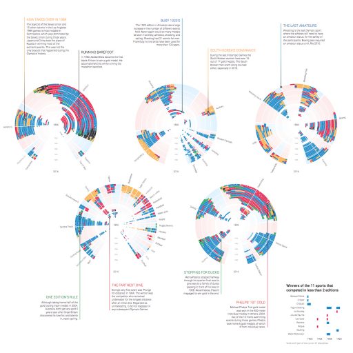
Olympic Feathers, 2016
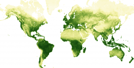
Breathing Earth, 2017
Bussed out, 2017, for The Guardian, in collaboration with Shirley Wu, Alastair Gee & “The Outside in America” staff at The Guardian.
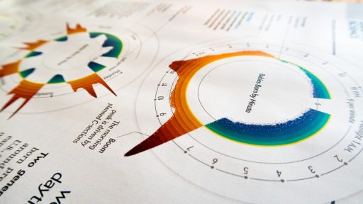
The Baby Spike, 2017, for Scientific American, in collaboration with Zan Armstrong & Jen Christiansen.
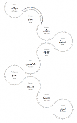
Beautiful in English, 2017, foor Google News Lab, in collaboration with Alberto Cairo & Simon Rogers.

Nadieh Bremer

Data Sketches: A Year of Exotic Data Visualizations
Data Visualization Designer, Visual Cinnamon (NL)

Data Visualization Designer, Visual Cinnamon (NL)

“Data Sketches: A Year of Exotic Data Visualizations”

Website
Twitter

Nadieh Bremer graduated as an astronomer and worked as a data scientist, but soon discovered a passion for data visualization design. She established the website Visual Cinnamon as the embodiment of her data visualization work, and has quickly made a name for herself in the field, working with organizations like Google News Lab and the Guardian to reveal impactful trends in large datasets. Her work features beautiful and uniquely crafted data visualizations which engage and enlighten audiences.

At Visualizing Knowledge, Nadieh will share her most important lessons from “data sketch|es,” her ambitious collaborative project with fellow designer Shirley Wu. Beginning in 2016, the duo worked monthly to create a separate unique data visualization, and wrote extensively about their creative process. This self-driven project attracted the attention of Alberto Cairo and Google News Lab, and Nadieh and Shirley created insightful visualizations from Google’s vast search term data. In this talk, Nadieh will share what she’s learned in the fundamental areas of data, sketching, and coding. She’ll discuss how some months’ projects became her favorites, what mistakes she made along the way, and how she worked to overcome them. She’ll highlight the humble, ugly-duckling beginnings to many visualizations, and the transformative iteration process that turned them into unique and, hopefully, compelling results.
Olympic Feathers, 2016
Breathing Earth, 2017
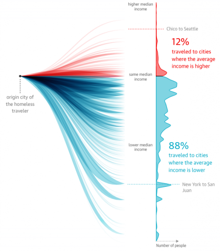
Bussed out, 2017, for The Guardian, in collaboration with Shirley Wu, Alastair Gee & “The Outside in America” staff at The Guardian.
The Baby Spike, 2017, for Scientific American, in collaboration with Zan Armstrong & Jen Christiansen.
Beautiful in English, 2017, foor Google News Lab, in collaboration with Alberto Cairo & Simon Rogers.

Post navigation

 Fidel ThometBoris Müller 

Contact

Visualizing Knowledge 2018

Design. Reveal. Act.


4 May, 2018

Dipoli, Aalto University

Otakaari 24, 02150 Espoo,

Greater Helsinki, Finland

Subscribe to our newsletter

Newsletter Form
vizknowledge@aalto.fi

Follow us

Facebook Twitter Instagram

Further Information

Facebook Event Website VK17 Visual Communication Design