Rebecca Conroy

Creating Narratives with Data (with Duncan Swain)
Co-founder and Creative Partner, Beyond Words Studio (UK)

Co-Founder and Managing Partner, Beyond Words Studio (UK)

“Creating Narratives with Data” (with Duncan Swain)

Rebecca Conroy is a partner, co-founder, and driving force behind Beyond Words Studio. The organization – made up of designers, researchers, and strategists – focuses on data-driven storytelling and pride themselves on producing excellent data journalism. As a studio, Beyond Words works with the BBC, Facebook, the Bill & Melinda Gates Foundation, and Visa, leveraging data to present stories in insightful ways. Rebecca has extensive experience of delivering complex projects on time and on budget. She was previously Chief Operating Officer for BBC.com, responsible for running the BBC’s international and commercial digital products.

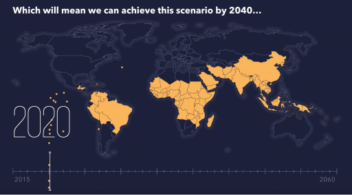
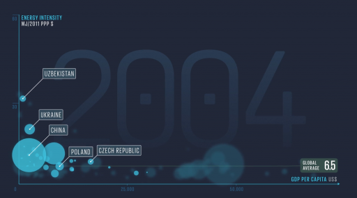
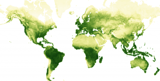
At Visualizing Knowledge, Rebecca, along with Beyond Words co-founder Duncan Swain, will give a behind-the-scenes look at how the studio told the complex, data-driven story of the biggest health intervention in human history: malaria.

Malaria off the map for the Bill & Melinda Gates Foundation, 2017.
Full of Spice Festival for Royal Botanic Gardens, Kew.
Sustainable energy motiongraphic for the United Nations. Watch the animations.

Duncan Swain

Creating Narratives with Data (with Rebecca Conroy)
Co-founder and Creative Partner, Beyond Words Studio (UK)

Co-founder and Creative Partner, Beyond Words Studio (UK)

“Creating Narratives with Data” (with Rebecca Conroy)

Duncan Swain is an award-winning creative director and co-founder of London-based Beyond Words Studio. The organization — made up of designers, researchers, and strategists — focuses on data-driven storytelling and pride themselves on producing excellent data journalism. As a studio, Beyond Words works with the BBC, Facebook, the Bill & Melinda Gates Foundation, and Visa, leveraging data to present stories in insightful ways. Duncan has over 20 years of experience in journalism, design, and digital platforms. Before founding the studio, he set the vision for BBC’s digital products as the creative and editorial director at BBC.com. He is a Visiting Fellow at University Arts London and London College of Communication, and a visiting lecturer at Stockholm’s prestigious creative business school Hyper Island.

At Visualizing Knowledge, Duncan, along with Beyond Words co-founder Rebecca Conroy, will give a behind-the-scenes look at how the studio told the complex, data-driven story of the biggest health intervention in human history: malaria.

Malaria off the map for the Bill & Melinda Gates Foundation, 2017.
Full of Spice Festival for Royal Botanic Gardens, Kew.
Sustainable energy motiongraphic for the United Nations. Watch the animations.

Ángeles Briones

Communication Design Strategies Using Data for Citizen Activism
PhD candidate in Communication Design, Politecnico di Milano, DensityDesign (IT)

PhD candidate in Communication Design, Politecnico di Milano, DensityDesign (IT)

“Communication Design Strategies Using Data for Citizen Activism”

Ángeles Briones is a designer and PhD candidate in Communication Design at Politecnico di Milano, and a collaborator at the university’s DensityDesign Research Lab. She’s interested in the various ways data can be used, especially at the citizen level. Ángeles’ research explores how grassroots activists use data as evidence for advocating their claims, and how they could make use of communication design strategies to reshape their actions. With DensityDesign most recently, Ángeles conducted research and helped create A Field Guide to Fake News and other Information Disorders, a relevant, practical guide for tackling misinformation in the news.

At Visualizing Knowledge, Ángeles will explore how citizen activists are starting to leverage data visualization techniques as part of their data activism communication repertoire. Through a case study analysis of 8 projects, she will present data strategies behind communicative artifacts that pursue citizen collective action. The analyzed cases consider their contexts, audiences and design techniques. The presented data design strategies seek to contribute to the role of designers involved in the communication design of citizen activism projects.

This work will be explored in even greater detail in Ángeles’ workshop, where participants will learn practical approaches to designing for citizen activism.

A Field Guide to Fake News and Other Information Disorders, DensityDesign 2017.

Urbanscope

João Wilbert

Designing Interfaces for the Future
Creative / Tech Lead, Google Creative Lab (BR)

Creative / Tech Lead, Google Creative Lab (BR)

“Designing Interfaces for the Future”

Brazil-born and London-based, João Wilbert is a programmer and designer at Google Creative Lab with a wealth of experience in creating tangible digital experiences that make technology more accessible. His work often focuses on the handoffs between digital and physical mediums, such as teaching programming fundamentals to children by creating a modular tangible programming experience of connectable physical blocks. João holds an MA in Interactive Media from Goldsmiths University of London and was awarded a scholarship at FABRICA, Benetton Group’s communication research center in Italy. His work has been exhibited at the Victoria & Albert Museum in London, New Museum in New York and CAFA Museum in Beijing.

Project Bloks, June 2016, Google Creative Lab
Project Jacquard, May 2015, Google ATAP & Google Creative Lab.

Pau García

A Love Story Between Data and People
Executive Director, Domestic Data Streamers (ES)

Executive Director, Domestic Data Streamers (ES)

“A Love Story Between Data and People”

Pau García is a researcher and designer in Barcelona interested in the area of new media technology and data languages. Currently, Pau heads the consultancy firm Domestic Data Streamers, working in research and communication projects for cultural institutions, organizations, and companies all over the world, such as the California Academy of Sciences, Western Digital, UNICEF, Nike or the Mobile World Congress. The work of Domestic Data Streamers often deals with tangible and immediate ways of representing data in a striking and thought-provoking fashion.

At Visualizing Knowledge, Pau will focus on how data changes the way we see our world. With the premise that we can learn more from ourselves and nature surrounding us than ever before, Pau will talk about the need for new tools to reach and translate this information into a universal language. He will focus on the work of his organization, Domestic Data Streamers, and their challenge of transforming raw data into interactive systems and experiences. From a background in new media and interaction design, Pau and his team create these experiences at the intersection of art, science, and sociology.

Lifeline, an exploration of infoexperiences. See video.

Boris Müller

Bringing Design to Science (with Fidel Thomet)
Professor for Interaction Design, Potsdam University for Applied Sciences, Urban Complexity Lab (DE)

Professor for Interaction Design, Potsdam University for Applied Sciences, Urban Complexity Lab (DE)

“Bringing Design to Science” (with Fidel Thomet)

Boris Müller is a Professor for Interaction Design at the University of Applied Sciences Potsdam and co-director of the Urban Complexity Lab, a research space sitting at the intersection of design and science. There, he focuses on design’s ability to make science and its progress understandable. Boris earned his MA from the Royal College of Art London in Computer Related Design, and his award-winning work focuses on generative design, data visualization and science communication. Boris’ prolific and honest writing about the prominence and purpose of interaction design has earned him a reputation as a thought leader in the field.

At Visualizing Knowledge, Boris will expand on the uneasy relationship between design and science. Design, to be more precise, has an uneasy relationship with science. Science on the other hand has almost no relationship with design and tends to happily ignore the excitements and commotions of the design world. Boris will present this work along with Urban Complexity Lab research associate Fidel Thomet. Boris will talk about how design not only helps scientists in communicating their research results, but also how design — especially visualization — has the potential to make contributions to the scientific progress itself.

Learn more about Fidel Thomet here.

A Brief History of C02 Emissions, 2017. See uclab.fh-potsdam.de/projects/co2
Poetry on the Road, 2006. With Andrea Schaffors, Florian Pfeffer. For Poetry on the Road.
GED Viz, 2011. With Jan Arpe (Bertelsmann Stiftung), Raureif, 9elements. For Bertelsmann Stiftung.
Mæve, 2009. See idl.fh-potsdam.de/projects/maeve
Shifted Maps, 2014 – now. With Heike Otten, Lennart Hildebrandt, Till Nagel, Marian Dörk.

Nadieh Bremer

Data Sketches: A Year of Exotic Data Visualizations
Data Visualization Designer, Visual Cinnamon (NL)

Data Visualization Designer, Visual Cinnamon (NL)

“Data Sketches: A Year of Exotic Data Visualizations”

Nadieh Bremer graduated as an astronomer and worked as a data scientist, but soon discovered a passion for data visualization design. She established the website Visual Cinnamon as the embodiment of her data visualization work, and has quickly made a name for herself in the field, working with organizations like Google News Lab and the Guardian to reveal impactful trends in large datasets. Her work features beautiful and uniquely crafted data visualizations which engage and enlighten audiences.

At Visualizing Knowledge, Nadieh will share her most important lessons from “data sketch|es,” her ambitious collaborative project with fellow designer Shirley Wu. Beginning in 2016, the duo worked monthly to create a separate unique data visualization, and wrote extensively about their creative process. This self-driven project attracted the attention of Alberto Cairo and Google News Lab, and Nadieh and Shirley created insightful visualizations from Google’s vast search term data. In this talk, Nadieh will share what she’s learned in the fundamental areas of data, sketching, and coding. She’ll discuss how some months’ projects became her favorites, what mistakes she made along the way, and how she worked to overcome them. She’ll highlight the humble, ugly-duckling beginnings to many visualizations, and the transformative iteration process that turned them into unique and, hopefully, compelling results.

Olympic Feathers, 2016
Breathing Earth, 2017
Bussed out, 2017, for The Guardian, in collaboration with Shirley Wu, Alastair Gee & “The Outside in America” staff at The Guardian.
The Baby Spike, 2017, for Scientific American, in collaboration with Zan Armstrong & Jen Christiansen.
Beautiful in English, 2017, foor Google News Lab, in collaboration with Alberto Cairo & Simon Rogers.

Fidel Thomet

Bringing Design to Science (with Boris Müller)
Research Associate, Potsdam University for Applied Sciences, Urban Complexity Lab (DE)

Research Associate, Potsdam University for Applied Sciences, Urban Complexity Lab (DE)

“Bringing Design to Science” (with Boris Müller)

Designer Fidel Thomet finds his interests in interaction design and data visualization, often combining the two in impactful, visual projects. No stranger to vast quantities of public data, he has spent time in Zurich and Berlin working with cities to present information in a straightforward and revealing way. Fidel has visualized intangible information, like reasons why people leave home in search of a better life, and more definite data, such as geospatial crime statistics from the city of Zurich. He recently moved to Berlin to join the Urban Complexity Lab at the University of Applied Sciences Potsdam, where he develops visualization tools for climate change scenarios.

Along with lab co-director Boris Müller, Fidel will present his work at the Urban Complexity Lab at Visualizing Knowledge. The two will focus on the uneasy relationship between design and science. Design, to be more precise, has an uneasy relationship with science. Science on the other hand has almost no relationship with design and tends to happily ignore the excitements and commotions of the design world. In the talk, Fidel will present his early results and insights from creating climate-change scenario tools, in close collaboration with climate research institutes. Intended for use by policy-makers, NGOs, and businesses as part of the ongoing SENSES Project, these tools use visualization to help make sense of climate change projections.

Learn more about Boris Müller here.

DNBVIS, 2017. With Marian Dörk, Katja Dittrich and Johannes Herseni. For German National Library.
Let’s map the gap, 2017. For Psychoanalytisches Seminar Zürich.
So gerecht ist Deutschland, 2017. With Hanna Decker and Christoph Schäfer, Frankfurter Allgemeine Zeitung.
Where2, 2016. For Open Data Zürich.

Topi Tjukanov

If a picture is worth a thousand words, how much is a map worth?
Data Visualization Freelancer (FI)

Data Visualization Freelancer (FI)

“If a picture is worth a thousand words, how much is a map worth?”

Geographer by day, geospatial visualization designer by night, Topi Tjukanov combines expertise in geography with a passion for data visualization. After graduating from Helsinki University with a Master of Science and a specialization in planning geography, Topi began working with the open data from the city of Helsinki and greater Finland to make insightful and revealing geospatial data visualizations. This approach has led to a freelance career — and a loyal Twitter following — developing works that often play with the perception of time and space, and aim to show the underlying patterns of activity that exist in daily life.

At Visualizing Knowledge, Topi will offer a peek through his geographical lens to data visualization by sharing his open-source geospatial toolstack. He will explain the process of making simple geospatial animations, which are an excellent ways to visualize spatiotemporal data. He will demonstrate how experimental ways of visualizing geospatial data, beyond animation, can blur the lines between normal data visualization, mapmaking and even data art.

Urban Forms
8-bit Ships
Growing Barcelona
Roads of America
European Population in 3D

Juho Ojala

Using Visualization to Solve Hard Problems
Co-Founder, Lucify (FI)

Co-Founder, Lucify (FI)

“Using Visualization to Solve Hard Problems”

Juho Ojala is a systems thinker fascinated by the challenge of communicating complex issues and dangerous ideas. His passion lies in designing and building software that makes data useful. In 2015, Juho and two friends founded Lucify, a Helsinki-based data visualization firm. Lucify’s interactive visualizations — for clients like the United Nations, Finnish Ministry of the Interior, and Aalto University — often tackle statistically complex issues, such as immigration application data and net European immigration.

At Visualizing Knowledge, Juho will speak about the promise of using dynamic visualization as a tool for thought to augment human thinking. The best way to explore what this means in practice is to try solving difficult problems in different domains. Juho will share useful advice on how visualization practitioners may structure their workflow and thinking, utilizing examples from two recent projects. He’ll examine how visualization greatly improves understanding when working with natural language processing, and share his process for creating a visual tool to gradually understand a complex topic, in this case, Einstein’s theory of relativity.

The Flow towards Europe
Inside Einstein’s head
me.Syrjässä