Data Narratives for Advocacy

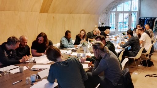
With Ángeles Briones, Density Design (IT)
Thu 3 May, 2018, 9:00 – 15:00 Design Factory, Aalto University

Using Data as Evidence: Data Narratives for Advocacy and Visualizing Data with RAWGraphs

Ángeles Briones, Density Design (IT)

Date: Thu 3 May, 2018
Time: 9:00 – 15:00
Venue: Design Factory, Aalto University
Bring: Own laptop with Adobe Illustrator (trial version for 7 days) and OpenRefine (free)
Prerequisite: Basics knowledge in graphic design and data handling
Venue details

When working with data evidence to support social change, we face a three-part process. We begin with understanding that the evidence we use could create narratives for a specific audience. Secondly, we make sense of the evidence, and thirdly, we take action.

This workshop intends to combine the contextual discussion about data narrative for advocacy with practicing it. During the workshop we will work with data on two fronts:
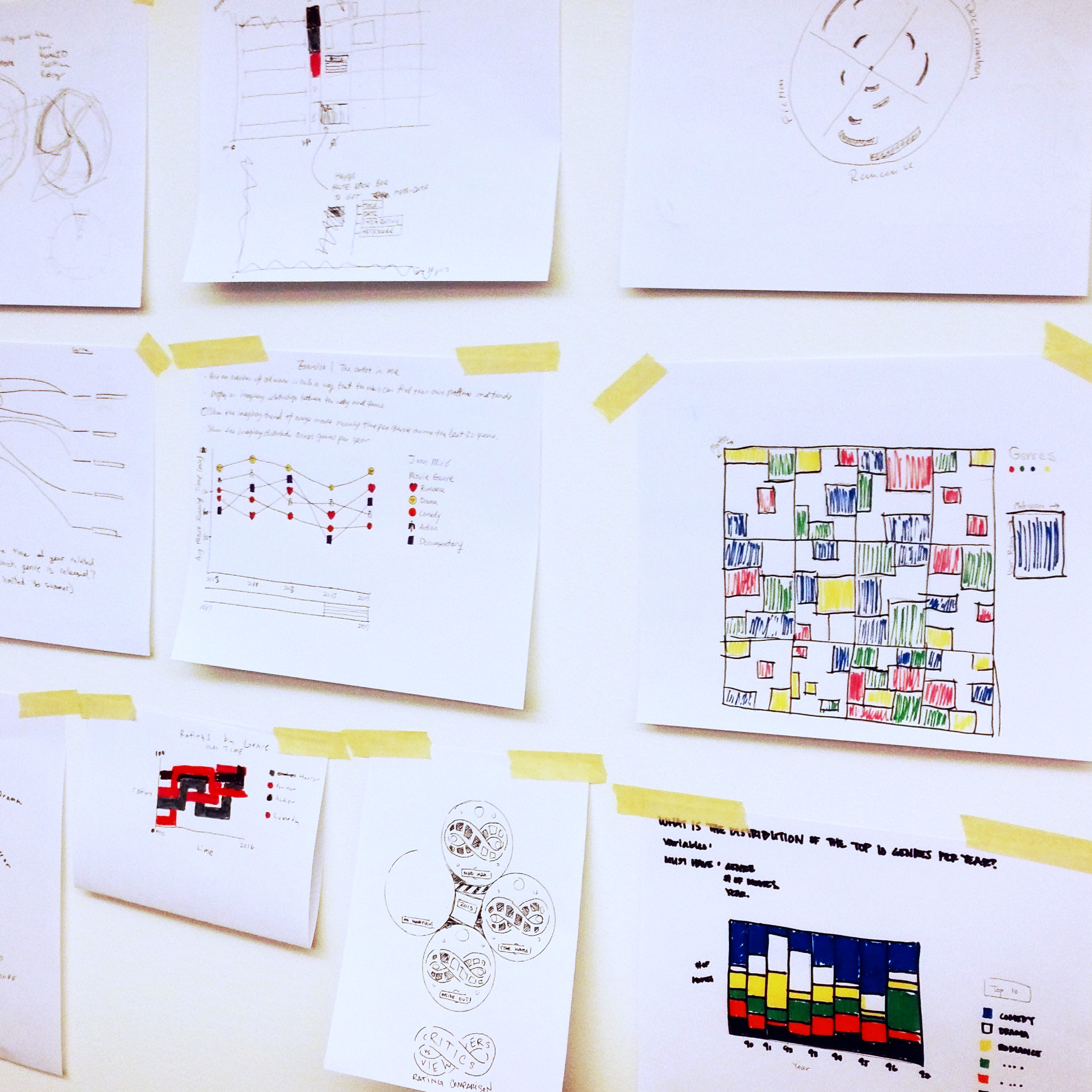
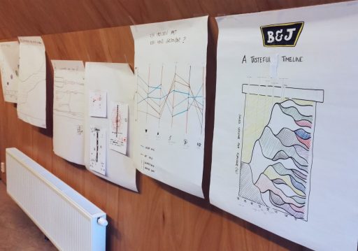
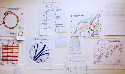
(1) Using a set of guidelines, we will discuss design narratives regarding data use for advocacy.
(2) We will get hands-on with data and use RAWGraphs to create visual representations for our narratives.

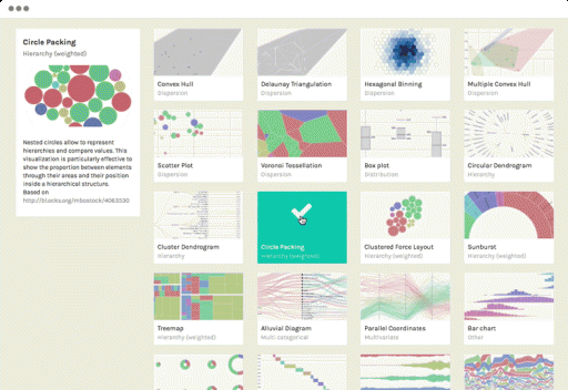
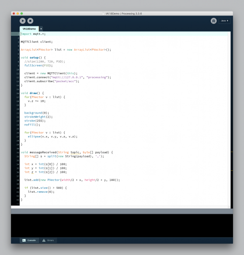
RAWGraphs, created by DensityDesign Research Lab and Calibro (formerly RAW), is a web application that allows you to easily create complex and compelling visualizations while still allowing for modification and fine-tuning afterwards. We will use a vector editor such as Adobe Illustrator to modify our visualizations. This workshop is for people interested in data visualization with basic knowledge in graphic design and data handling. Participants should bring their own laptop with a modern browser and access to Adobe Illustrator. Feel free to bring your own dataset to visualize, and join us on 3 May!

The workshop is taught by Ángeles Briones from DensityDesign. Ángeles will also be giving a talk on this subject at the VK18 conference on 4 May.


Real-Time Sensor Data Visualization – FULL

With Joël Gähwiler, Zurich University of the Arts (CH)
Wed 2 & Thu 3 May, 2018, 9:00 – 17:00
Learning Center, Aalto University

Real-Time Sensor Data Visualization – FULL

Joël Gähwiler, Zurich University of the Arts (CH)

Date: Wed 2 & Thu 3 May, 2018
Time: 9:00 – 17:00
Venue: Learning Centre, Aalto University
Venue details
Bring: Own laptop, preferably MacOs
Prerequisite: Basics in programming

Modern technology allows data to flow rapidly between systems. For example, data from sensor networks is often available immediately to allow algorithms to efficiently optimize and control systems. As these systems get more complex over time, visualizing these real-time data flows is gaining increasing importance as a tool for understanding what’s going on.

In this two-day workshop, we will look at different ways to visualize continuous streams of data. For that, we will use Processing to interpret and visualize real-time data emitted by an an electronic device. After a brief introduction to the technology kit, participants will enter an iterative design process in which they work towards a screen-based visualization to represent the gathered data. Learn and practice information design techniques for working with continuous and rapid data. The experiments are collected and shown at the exhibition accompanying the Visualizing Knowledge conference.

Joël Gähwiler is a research associate and head of the Physical Computing Lab Interaction Design, Zurich University of the Arts. His research is focused on the Internet and Things by which he seeks to formulate a design theory for networked artifacts: networkedartifacts.info


Creative Data Visualization Techniques – FULL

With Nadieh Bremer, Visual Cinnamon (NL)
Thu 3 May, 2018, 9:00 – 17:00 Dipoli, Aalto University

Creative Data Visualization Techniques – FULL

Nadieh Bremer, Visual Cinnamon (NL)

Date: Thu 3 May, 2018
Time: 9:00 – 17:00
Venue: Dipoli, Aalto University
Venue details

With so many readily available ways to visualize data, it’s easy to fall back on tried-and-true methods or get stuck with the limitations of the tools at your disposal.

In this workshop, we’ll show you how to step away from conventional methods and take a more creative and hands-on approach to data visualization design. Learn how to start from inventive initial concepts for your visualizations and move beyond typical charts.

This workshop is geared toward designers, journalists, scientists, educators and decision-makers interested in using information in their work. Participants will learn how to create data visualizations that engage their audience and effectively convey data-based insights in a unique and eye-pleasing manner. We will explore original tools and approaches for visualizing data. Those interested should have a basic interest and understanding in creating data visualizations. Build confidence with information design and stretch your visualization muscle!

The workshop is taught by Nadieh Bremer from Visual Cinnamon. Nadieh will also be giving a talk at the VK18 conference on 4 May.