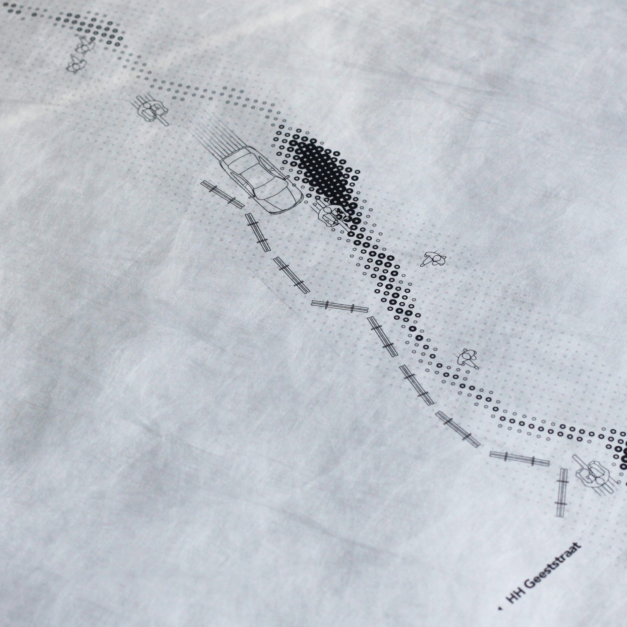
Zhiliang Shen, Nanjing University of the Arts
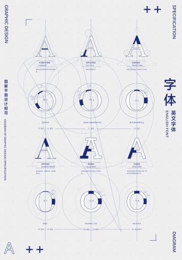
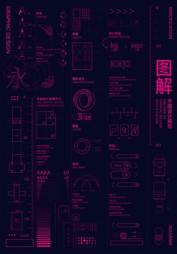
Diagram of Graphic Design Specification
Designer: Zhiliang Shen
Institution: Nanjing University of the Arts
City, Country: Nanjing, China
Teacher: Chen Hao
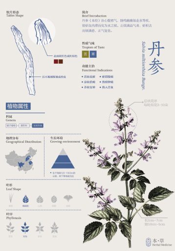
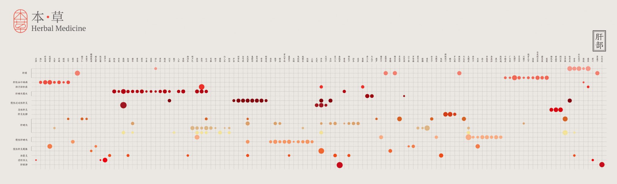
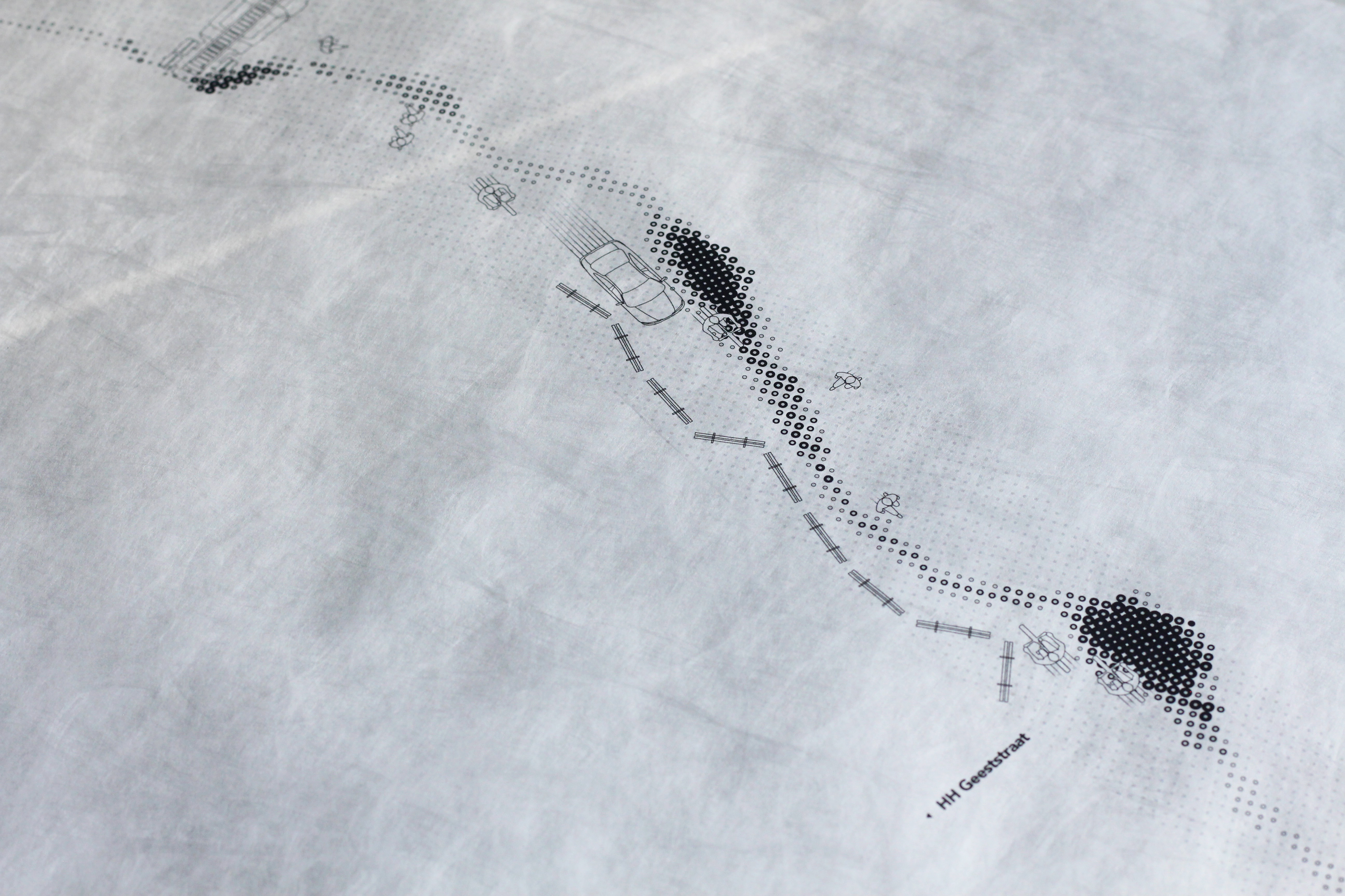
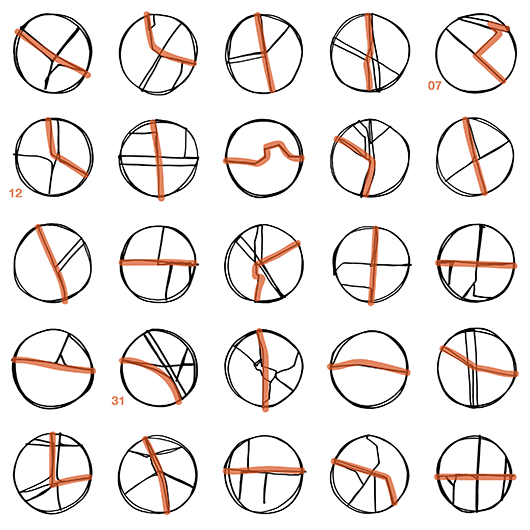
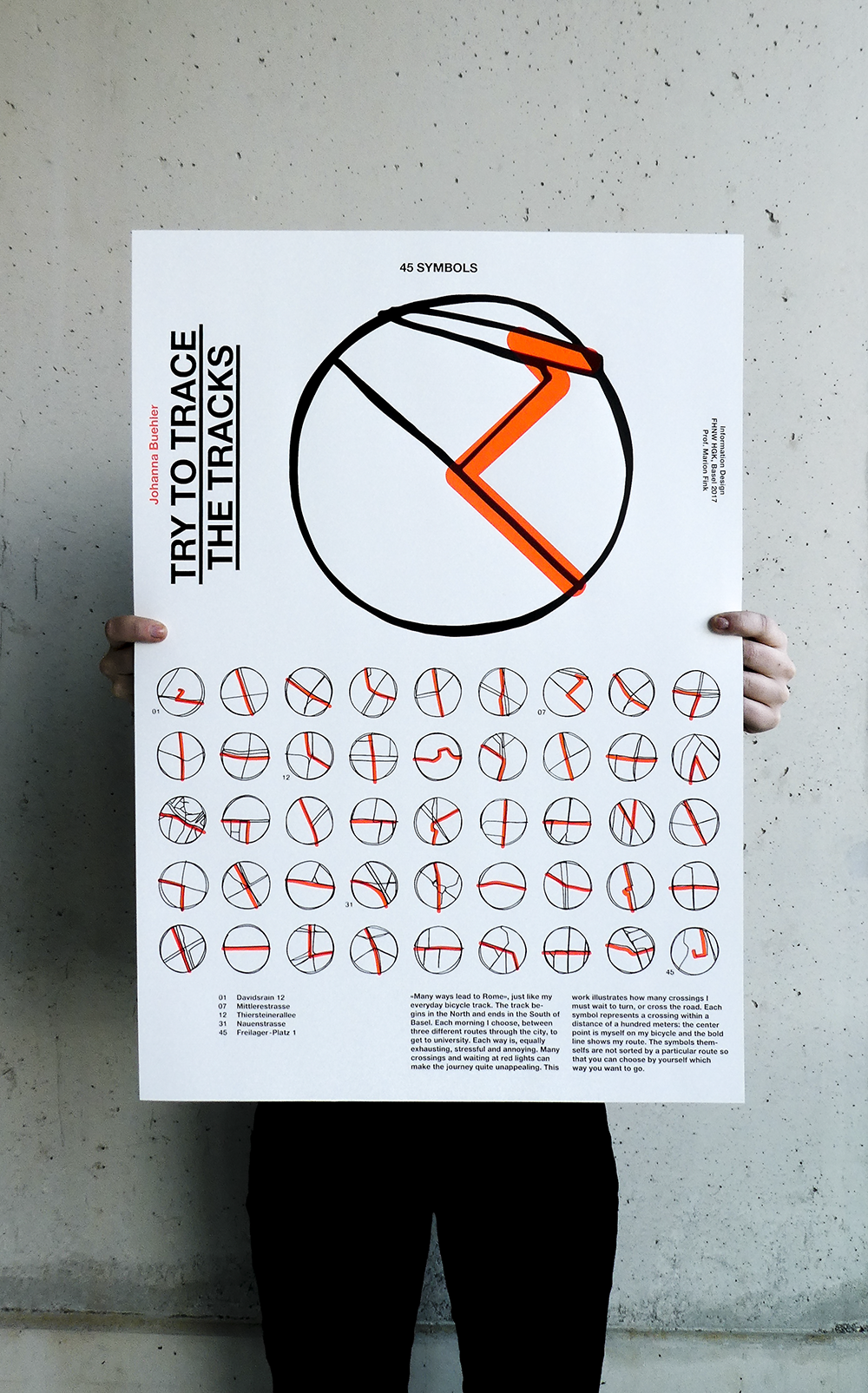
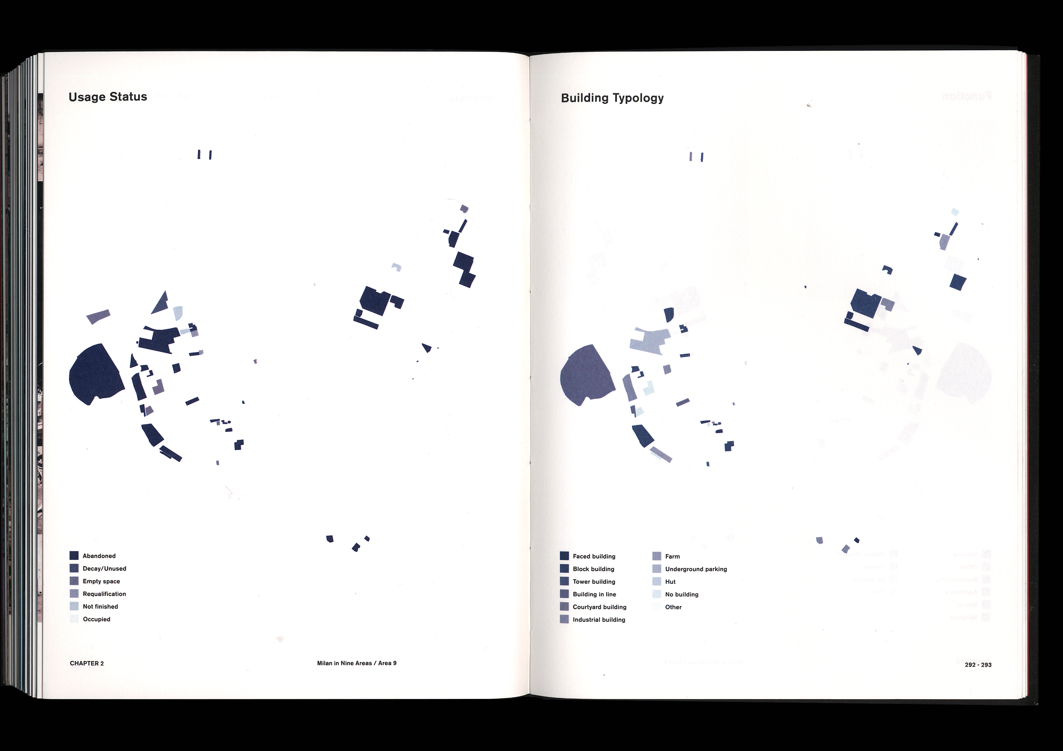
The traditional graphic design standard books are mostly based on long text content, boring and inconvenient, they are hard to read. Therefore, “Diagram of Graphic Design Specification” make the graphic design specification in accordance with the font, layout, color, graphic design and printing and so on the basis of the compiled into knowledge, using the graphic design let an interesting boring information into visual information graph, facilitate graphic design beginners understanding, memory and access to the basic knowledge of graphic design.


 .
.